Data Package Trading Website
Redesign of a data package trading platform used by customer representatives, focusing on simplifying a complex, outdated interface while maintaining robust functionality.
Osmanli Yatirim Bank, 2021
Osmanlı Yatırım Bank needed to modernize their internal data package trading platform—a critical tool used daily by customer representatives to manage trading data subscriptions for clients. The existing system had grown unwieldy over the years, with a cluttered interface that slowed down representatives and increased the risk of errors during transactions.
The Challenge
The legacy platform presented several obstacles that impacted both efficiency and user satisfaction:
- Information overload: The interface displayed too much data simultaneously, making it difficult for representatives to focus on the task at hand
- Inconsistent workflows: Different actions required different mental models, increasing training time for new representatives
- Limited visibility: Representatives couldn't easily see a customer's complete package history or current subscription status
- Error-prone processes: Critical actions like package cancellation lacked proper confirmation flows, leading to accidental cancellations
- No domain expertise: Our team initially had limited understanding of trading data packages, requiring extensive stakeholder collaboration
Research & Discovery
I began with competitive analysis to understand industry standards for trading platforms. Regular collaborative sessions with bank representatives and stakeholders helped map out user flows in Miro. These sessions revealed that representatives needed to perform three core tasks efficiently: find customers quickly, browse and sell appropriate packages, and manage existing subscriptions.
Key insights from user research:
- Representatives handle 50+ customer interactions daily
- Most common task is checking existing package status
- Package configuration options are complex but follow predictable patterns
- Quick access to recent customers saves significant time
Design Approach
I adopted an incrementalist methodology, breaking the project into testable micro-components. This allowed for continuous validation with actual users while maintaining development momentum. Material Design components accelerated production while ensuring consistency.
Tools used: Adobe XD for design, Miro for user flows, Overflow for prototype feedback, Zeplin for developer handoff.
Customer Search & Dashboard
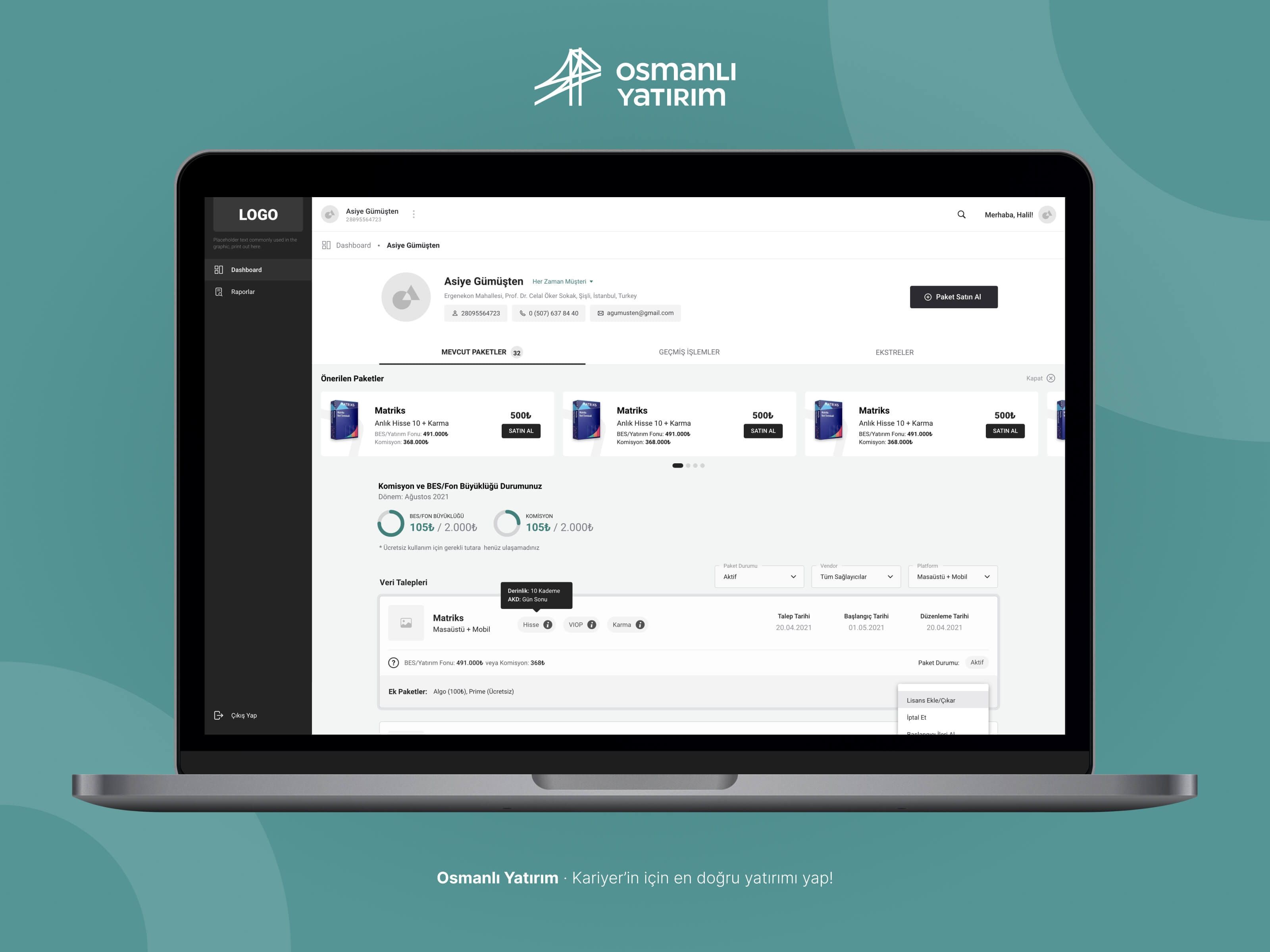
The redesigned dashboard starts with a clear call-to-action: find a customer. The prominent search field with recent search history allows representatives to quickly access frequently-served customers. This customer-first approach reflects the actual workflow—every transaction begins with identifying who you're serving.
Once a customer is selected, the dashboard transforms into a comprehensive overview. The customer profile appears at the top with contact details readily accessible. Below, recommended packages based on the customer's profile are displayed in a carousel for quick selling opportunities.
Key metrics—Commission and BES/Fund Size—are visualized with progress indicators, giving representatives instant insight into the customer's account status. The data requests table below shows all active packages with filtering options for status, vendor, and platform type.
Package Discovery
When representatives need to sell a new package, the package listing page organizes options into logical categories: Osmanlı Applications, Professional Screens, Algorithms, and Other Applications. Within each category, sub-filters (like Matriks, Ideal, Foreks) allow further refinement.
The recommended packages carousel persists at the top, keeping AI-driven suggestions visible throughout the browsing experience. Each package card displays the product image, name, platform type, description, and price—all the information needed to make a recommendation without clicking through.
Package Configuration
The package detail view is where the real complexity lives. Trading data packages have multiple configurable options: market type (Karma, Hisse, Viop), depth levels, and broker distribution settings. Rather than overwhelming users with all options at once, I organized them into collapsible sections.
The license information table provides a clear overview of what's included, with checkboxes for selection and dropdown menus for specific configurations. Below, accordion sections group additional options: Algorithmic Trading & Server, Research & Applications, and Structural Indexes.
When expanded, each section reveals selectable add-ons with individual pricing. The running total updates in real-time at the bottom, along with a breakdown of BES/Investment Fund contribution and commission. The sticky footer ensures the "Approve" button and total are always visible, regardless of how far the user scrolls.
Safe Cancellation Flow
Package cancellation is a high-stakes action that previously lacked proper safeguards. The new design introduces a dedicated confirmation modal that clearly states the consequences. The package being cancelled is displayed with full details, and an informational alert warns about billing implications.
The cancellation timing selector allows representatives to choose when the cancellation takes effect—immediately or at the end of the billing period. The destructive action button is styled in red to differentiate it from standard actions, reducing accidental clicks.
Reflection
This project reinforced the importance of domain immersion when designing for specialized industries. Trading data packages are inherently complex, and our initial designs missed critical nuances that only emerged through repeated stakeholder sessions.
The incrementalist approach proved valuable—by testing micro-components with actual representatives throughout development, we caught usability issues early and built confidence in the new system. The final platform reduced average transaction time by streamlining the most common workflows while maintaining the sophisticated functionality that power users required.