Letgo: Redesigning the Filtering & Sorting Experience
A UX evaluation and redesign of Letgo's filtering and listing screens, identifying usability issues through heuristic analysis and delivering an improved experience that helps users find what they're looking for faster.
Letgo, 2024
Letgo was a popular mobile marketplace app that allowed users to buy and sell second-hand items locally. With its visual-first approach and location-based listings, the app aimed to make selling as easy as taking a photo. However, as the product catalog grew, users faced increasing difficulties finding what they were looking for. This case study documents my heuristic evaluation of the filtering and sorting experience, identifying key usability issues and proposing design improvements.
The Challenge
When browsing thousands of listings in a marketplace app, effective filtering and sorting become essential. Users need to quickly narrow down results to find relevant items. Through my analysis, I discovered that Letgo's filtering and listing screens suffered from several usability problems that increased cognitive load, created confusion, and ultimately made it harder for users to discover products.
Research Method: Heuristic Evaluation
I conducted a heuristic evaluation using Nielsen's 10 Usability Heuristics as a framework. This expert review method allowed me to systematically identify usability problems by examining the interface against established principles such as visibility of system status, consistency and standards, error prevention, and efficiency of use. Each issue was documented with screenshots and annotated with specific heuristic violations and improvement recommendations.
Findings: Filter Panel & Listing Screen Issues
The first set of issues I identified related to the core filtering experience and listing screen presentation.
Key issues identified:
-
Inadequate filter categories: The filtering categories appeared insufficient for users who needed more granular control over their search results. A well-structured, detailed filtering system would help users find exactly what they're looking for faster.
-
Missing search within filters: Having filtering or search options readily available would provide a faster experience. Since this is a feature that provides ease of searching, user expectations are high for this functionality.
-
Price display inconsistencies: Using price breakdowns within the listing provides more detail about products. However, inconsistent price formatting across listings can create usability concerns and lead to confusion during first use.
-
Single city limitation: Users may want to select multiple cities when searching for products. This is particularly relevant for users who might be willing to travel to neighboring areas or who live near city boundaries.
Findings: Listing View & Apply Filter Flow
The second evaluation focused on how listings are displayed and how the filtering flow concludes.
Key issues identified:
-
Incorrect stepper usage: A stepper component was used for selecting values like brand or category, requiring users to scroll through options one by one. This dramatically reduces efficiency for lists with many items.
-
Ambiguous "Save" button: The top "Save" button creates confusion—users cannot immediately tell if it saves the product to favorites or saves their search/filter settings.
-
Missing gaps between cards: Product cards had no visual separation between them, making it difficult to distinguish where one listing ends and another begins.
-
Filter state not persistent: When users apply filters and then navigate to view a product detail, returning to the listing sometimes reset their filter selections, forcing them to start over.
-
"Apply" button positioning: The Apply button's position within the filter modal was not immediately clear, and users were uncertain whether their filter changes had been applied.
-
Filter count display issues: The filtering icon's count indicator (showing number of active filters) was not displaying properly, leaving users uncertain about their current filter state.
Findings: Category Selection Problems
The category selection flow revealed several interaction design issues.
Key issues identified:
-
Confusing selected category position: Having the selected category title appear at the top of the category list was disorienting. Users expected to see their selection highlighted in place, not moved to a different location.
-
"All Categories" cognitive load: Displaying the "All Categories" menu in a non-standard way created a scenario users weren't accustomed to. This increased cognitive load and disrupted the filtering flow.
-
Keyboard behavior problems: During filtering, the keyboard remained open even after making selections in some cases, obscuring the interface and requiring extra taps to dismiss.
-
Poor empty state: When no listings matched the selected category, users saw a generic empty state without helpful guidance on how to broaden their search.
Findings: Sorting Options Confusion
The sorting functionality had significant clarity issues.
Key issues identified:
-
Wrong pattern for date options: Checkbox components were used for mutually exclusive date range options. Radio buttons or a different selection pattern would be more appropriate since users can only select one time period.
-
Vague "Smart Sorting" label: The term "Smart Sorting" provided no clarity about how items would actually be ordered. From a UX perspective, users need clear labels to make quick and accurate selections. Options like "Most Relevant," "Newest First," or "Closest to You" would be far more transparent.
-
Unclear date direction: The "Publication Date" sorting option didn't indicate whether it sorted from newest to oldest or vice versa, leaving users guessing.
-
Poor "No Results" handling: When no results matched the selected filters, users saw a blank screen without transparency about why. The system should clearly inform users and provide an easy way to reset filters.
Findings: Listing UI & Visual Hierarchy
The final evaluation examined the overall listing presentation and visual design.
Key issues identified:
-
Disruptive promotional banners: Ads and promotional banners placed within the listing grid interrupted the browsing flow and made it harder to scan products.
-
Inconsistent image cropping: Product images were not cropped or sized consistently, creating a chaotic visual rhythm that made the listing feel unprofessional and harder to scan.
-
Missing key information: Product cards didn't consistently surface key information like item condition, seller rating, or time since posting—details that help users make quick decisions.
-
Visual hierarchy problems: The varying image sizes and text treatments made it difficult for users to quickly compare listings and identify relevant items.
Design Solutions
Based on the findings from the heuristic evaluation, I redesigned the filtering and sorting experience with a focus on clarity, efficiency, and user control.
Restructured Filter Architecture
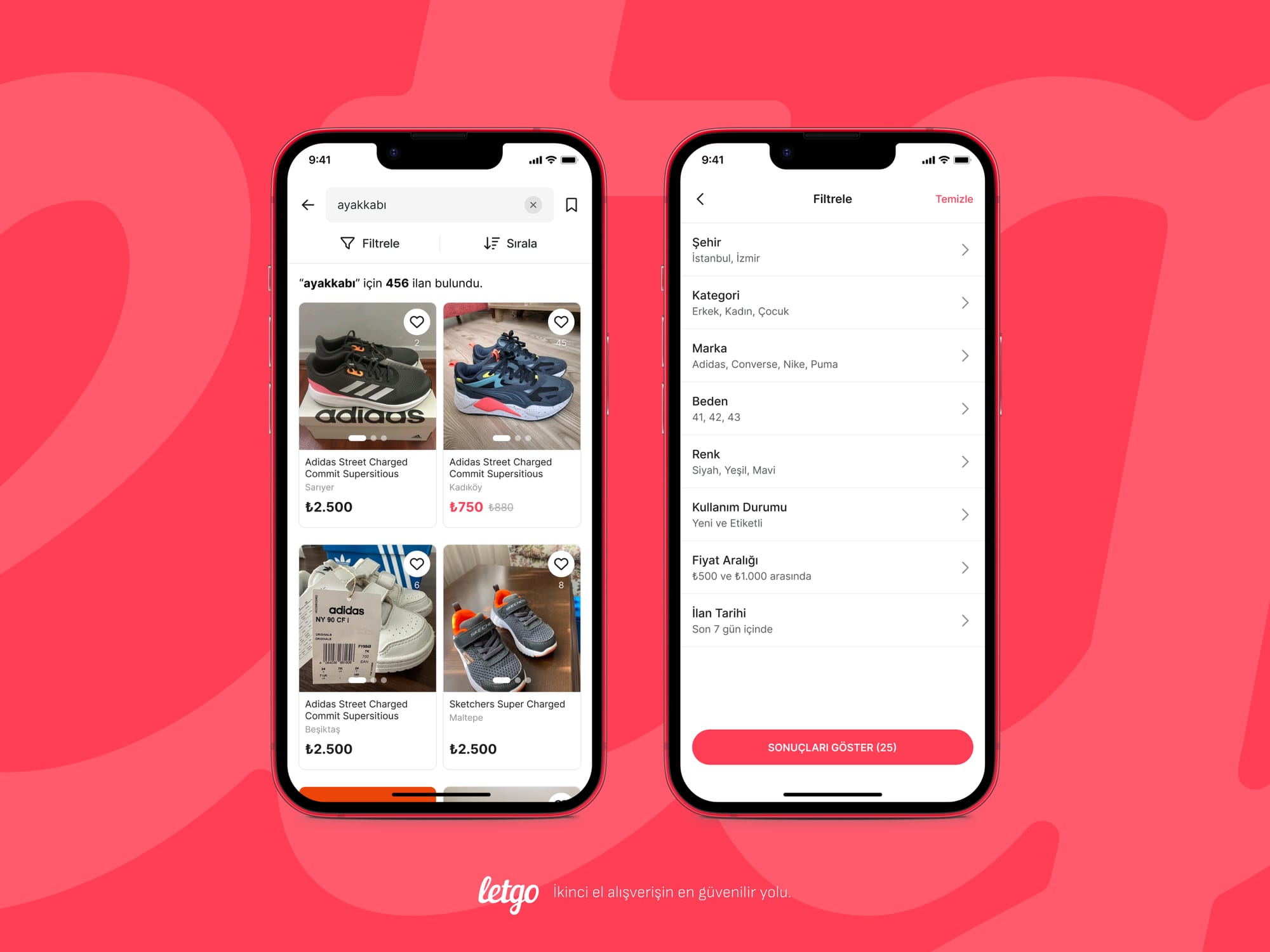
The redesigned filter panel introduces a clear hierarchy of filter categories. The listing screen now displays the total number of results prominently, while dedicated "Filter" and "Sort" buttons provide clear entry points. The filter panel itself presents all available categories (City, Category, Brand, Size, Color, Condition, Price Range, Listing Date) in a scannable list. When filters are applied, users see a summary of their active selections with the ability to review and modify them before viewing results.
Multi-City Selection with Quick Search
One of the key improvements addresses the single-city limitation. Users can now select multiple cities simultaneously using checkboxes, with result counts displayed next to each option. A quick search field at the top allows users to instantly find specific cities without scrolling through the entire list. Selected cities appear at the top with a clear visual indicator.
Optimized Selection Patterns
Each filter type now uses the most appropriate interaction pattern. Brand selection features a searchable checkbox list for quick multi-select. Size selection uses a grid layout that allows users to tap multiple sizes at once, perfect for shoppers who wear between sizes. Color selection displays actual color swatches alongside names and result counts, making visual scanning effortless.
Condition & Price Range Filters
The condition filter now includes helpful descriptions for each option (e.g., "Never used, tags still attached" for New with Tags), reducing ambiguity. The price range filter offers two interaction modes: preset ranges for quick selection, or manual input for users who know exactly what they want to spend. The manual mode provides instant feedback, showing the filter as "₺250 and above" as users type.
Save Search Functionality
A new "Save Search" feature allows users to preserve their filter combinations for future use. Accessible via the bookmark icon next to the search bar, tapping it opens a bottom sheet where users can name their search and optionally enable notifications for new matching listings. This addresses the frustration of repeatedly configuring the same filters and turns one-time searchers into engaged, returning users.
Transparent Sorting Options
The sorting redesign replaces vague labels with clear, descriptive options. "Smart Sorting" now includes an explanation of how it works, appearing in a tooltip when users need clarification. The full sorting menu presents options like "Most Liked," "Most Viewed," "Listing Date: Newest First," and "Price: Low to High" — each unambiguous about the resulting order. Radio buttons replace the incorrect checkbox pattern, correctly indicating mutual exclusivity. When a sorting option is active, a small dot in the primary color appears next to the Sort button, giving users a persistent visual indicator that their results are being sorted.
Reflection
This heuristic evaluation revealed that even successful apps can accumulate significant usability debt over time. Letgo's filtering and sorting experience, while functional, created unnecessary friction at nearly every step of the product discovery journey.
The issues I identified fell into recurring patterns: inconsistent design patterns, ambiguous labels, poor feedback mechanisms, and violation of user expectations. Each problem individually might seem minor, but collectively they compound into an experience that frustrates users and likely impacts conversion.
This analysis reinforced a key principle: discoverability features like filtering and sorting deserve the same design rigor as primary user flows. When users can't find what they're looking for efficiently, the entire marketplace experience suffers—no matter how good the core buying and selling mechanics might be.
Figma Screens
Explore the complete design file below, including all screens, components, and interaction flows.