Creating a Design System and Tokenomics
This project focuses on developing a comprehensive design system for Joi Gifts, aimed at ensuring visual consistency across all digital touchpoints.
Joi Gifts, 2024
"Design systems provide a shared language and set of guidelines that enable teams to work more efficiently and create cohesive user experiences." - Nathan Curtis
Overview
This project establishes a unified design system for Joi Gifts ensuring consistency across desktop, mobile web, and native applications. The goal is to streamline processes for a cohesive user experience.
Objectives
- Establish comprehensive design system for Joi Gifts
- Ensure design and usability consistency across platforms
- Bridge design-development team gaps
- Create efficient workflow reducing future costs
Introduction
The initiative was explained to teams emphasizing cost-effectiveness and consistency benefits. The goal was to eliminate design-development gaps and create a single source of truth.
Research & Incremental Approach
We started with essentials, created a component checklist, and excluded non-essential items to focus on what matters most for the product.
Token Creation
We used Figma and Token Studio plugin to create design tokens including colors, typography, spacing, sizing, and shadows. These were converted to JSON for GitHub sharing, enabling rapid codebase updates.
Colors
The color system establishes a cohesive palette that reflects the brand identity while ensuring accessibility and visual hierarchy.
Sizing & Spacing
Consistent sizing and spacing tokens create rhythm and harmony across the interface, making the product feel polished and intentional.
Shadow & Border Radius
These tokens add depth and softness to the interface, creating a modern and approachable visual language.
Typography
The typography system defines type scales, weights, and styles that ensure readability, hierarchy, and professionalism across all content.
Collaboration & Development
Regular developer meetings ensured successful implementation. Tokens and components were updated as needed based on feedback.
Challenges
The primary obstacle involved convincing the team and stakeholders despite initial costs. However, the long-term benefits proved invaluable.
Component Library
A comprehensive system of reusable UI components with documented variants and states.
Form Controls
Essential form elements including checkboxes, radio buttons, and switches with consistent styling and interaction patterns.
Feedback Components
Components for user feedback including alerts, bottom sheets, and popups that maintain consistency in how we communicate with users.
Interactive Elements
Date pickers, emoji ratings, and color selection buttons that provide rich interaction while maintaining visual consistency.
Cards & Overlays
Add-on cards and popup components for displaying grouped content and modal interactions.
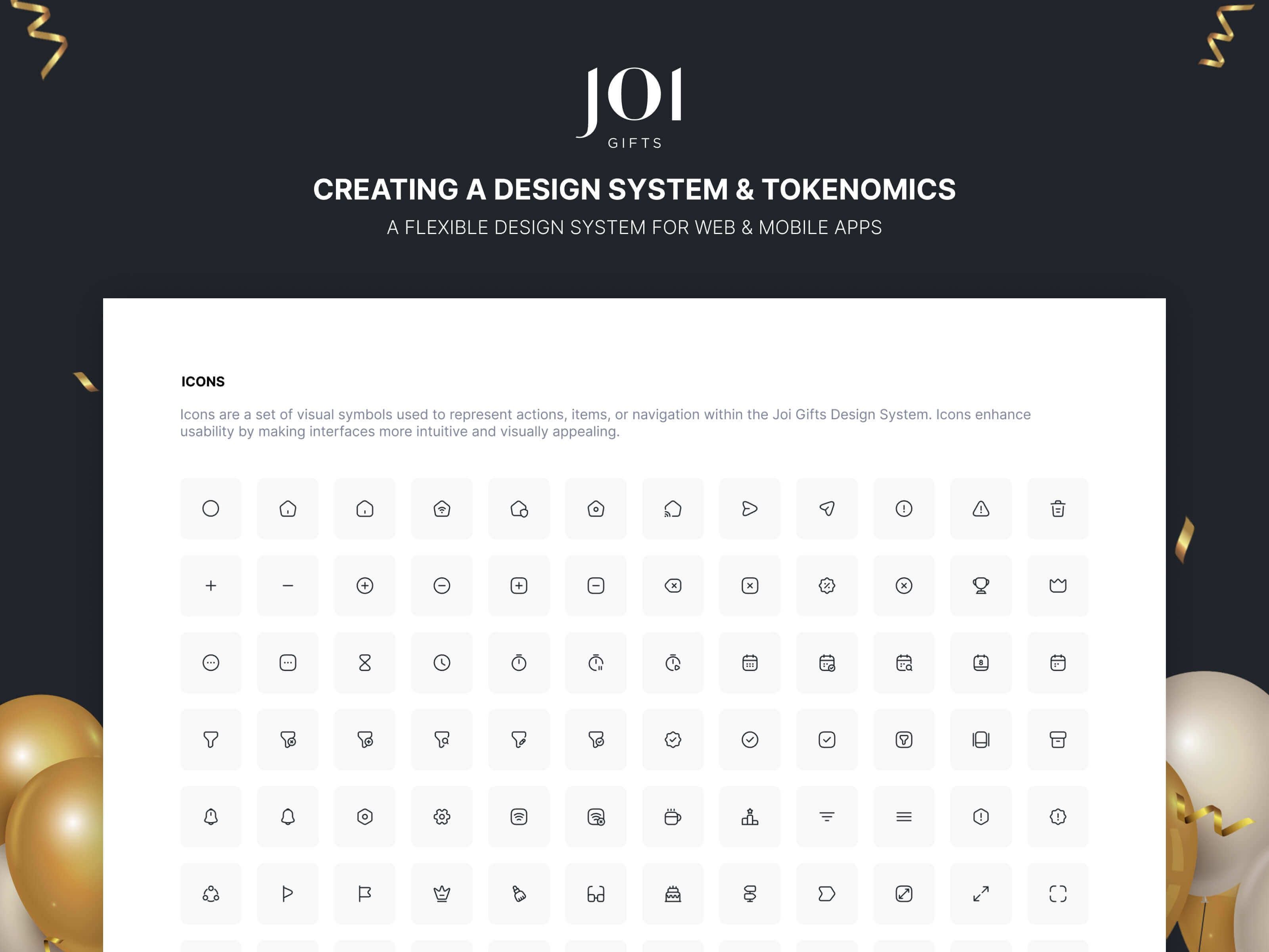
Iconography
Meticulous selection prioritizing stroke thickness for clarity, readability, and accessibility standards. Icons balance accessibility and aesthetics, enhancing recognition and visual harmony.
Country Flags
Country flags are integral to country selection flows. They were designed in square, rounded, and circular versions, and shared with the Figma community as "Awesome Country Flags" asset.
Conclusion
The design system functions as an organic, evolving tool meeting Joi Gifts' needs. It reduced design-to-development handoff time by 40% and ensured consistent user experience across all platforms. It now serves as the single source of truth for all product teams.