Revamping Cecconi's Miami Beach Website
"Your old site is the best prototype of your new site." - Hoa Loranger
Embarked on a redesign journey to elevate Cecconi’s Miami Beach website, focusing on enhancing user engagement, visual appeal, and functionality.
Overview
Redesigned the desktop version of Cecconi’s Miami Beach website with a focus on enhancing user engagement and providing a seamless browsing experience. Key pages revamped include the Home, About Us, and Reservation pages, with specific attention to improving visual appeal, usability, and functionality.
Objectives
- Create an inviting and vibrant Home page to captivate visitors.
- Establish social media integration to foster engagement and trust.
- Ensure essential information such as location and contact details are easily accessible.
- Enhance user experience by making key actions like booking a table more visible and intuitive.
- Optimize information architecture to improve content organization and user navigation.
- Integrate the menu directly into the website for improved accessibility and SEO.
Design Process
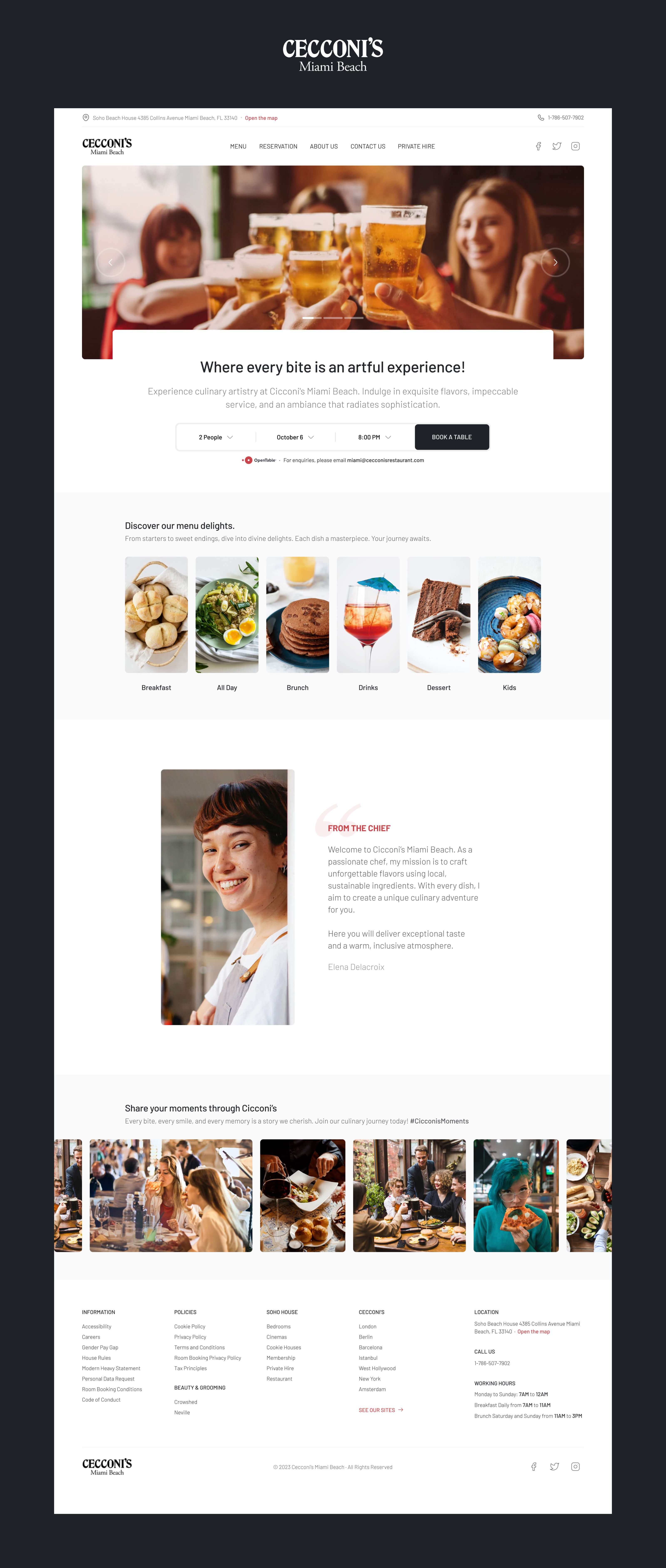
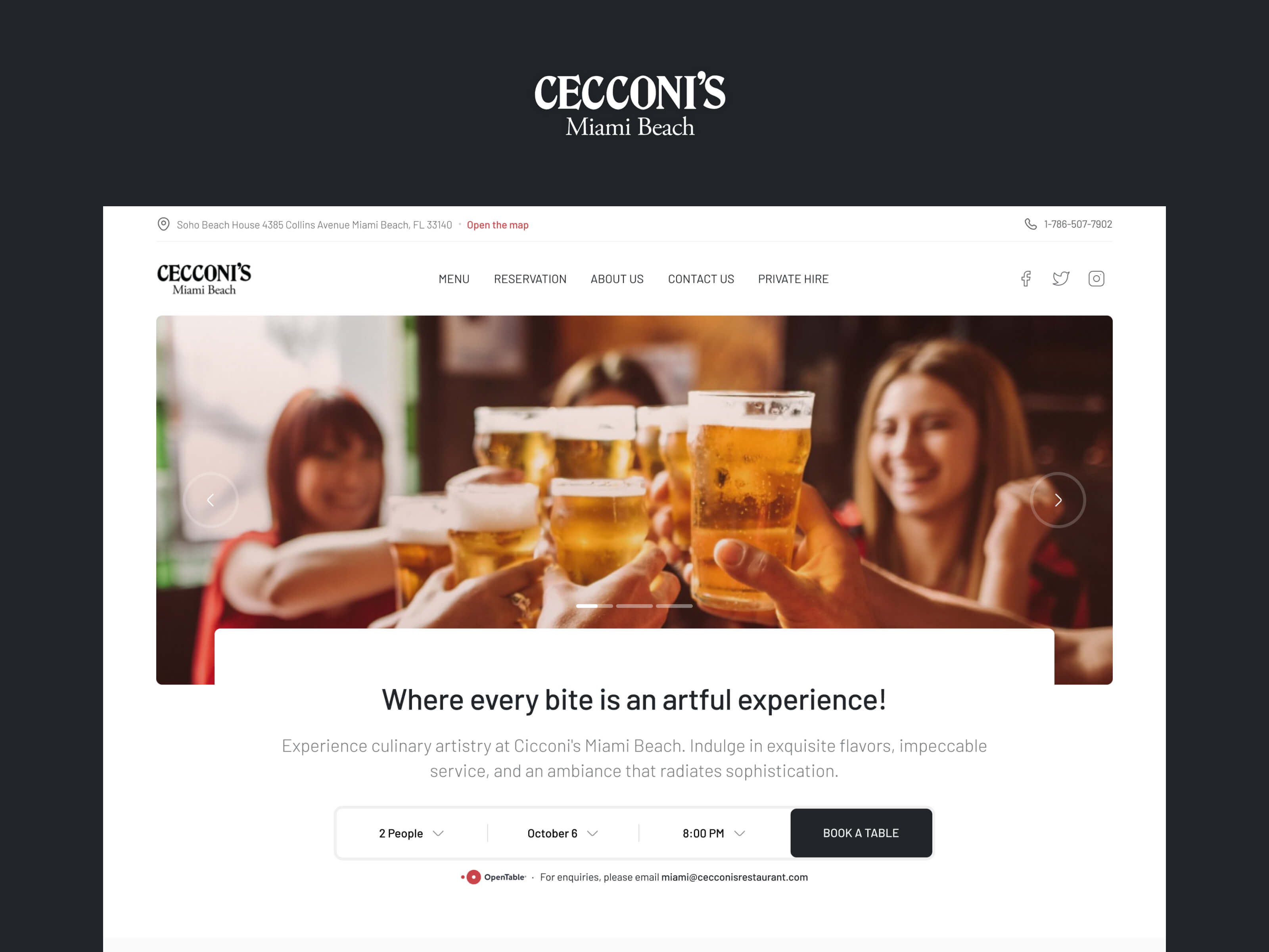
Hero Section: Reimagined the hero section with an image depicting a lively restaurant atmosphere, evoking positive emotions and human connection. Emphasis was placed on the psychological impact of visual storytelling to create warmth and engagement.
Social Media Integration: Positioned social media links prominently at the top of the page, accompanied by user-generated content showcasing joyful moments at Cecconi’s. This approach enhances credibility and leverages social proof to build trust.
Location and Contact Details: Ensured the visibility of essential information by relocating the address and phone number to the top bar section, optimizing accessibility across all devices.
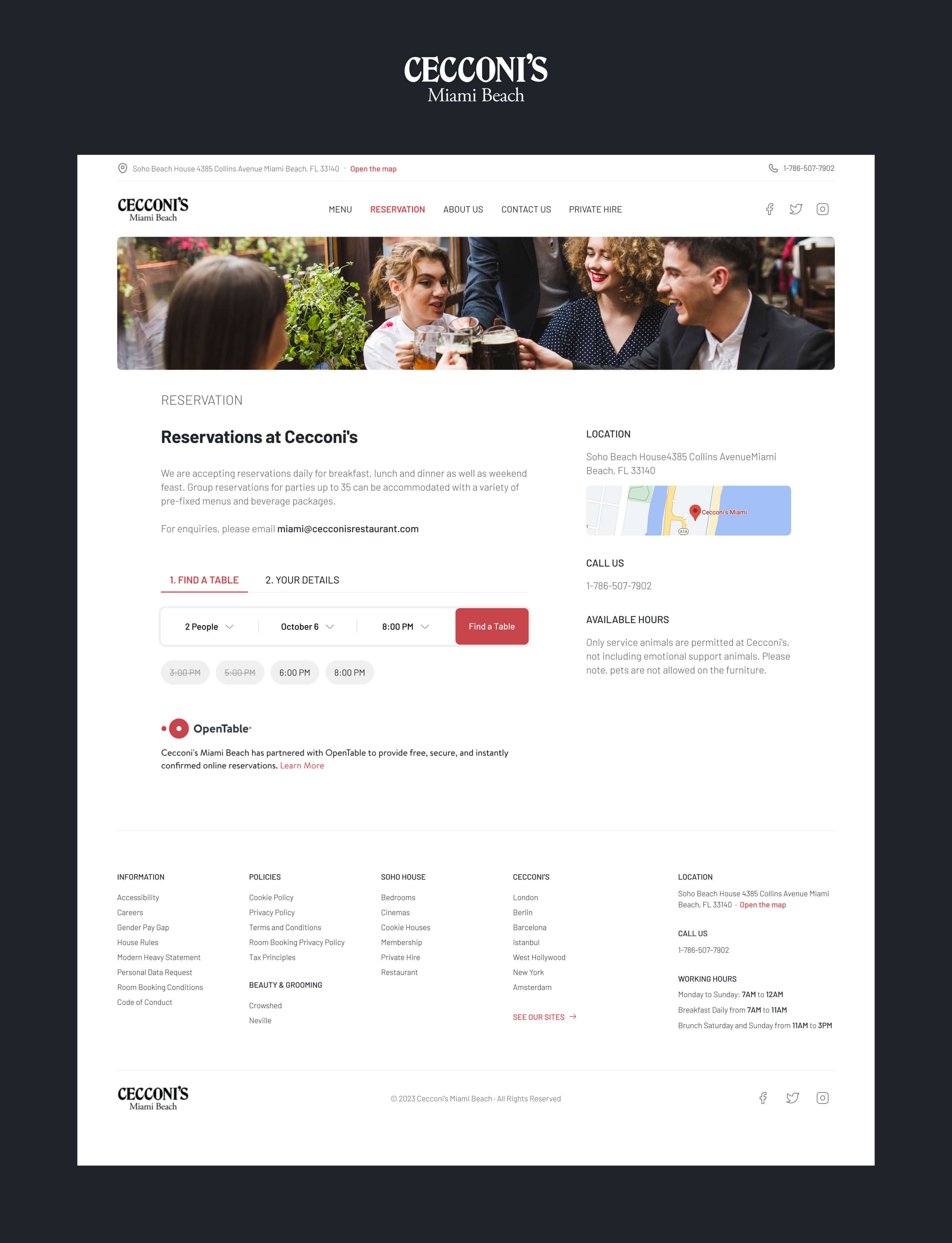
Book a Table: Elevated the prominence of the ‘Book a Table’ button, making it easily accessible below clear titles and descriptions. In an alternative version, the booking form was strategically placed beneath the hero section to maximize user attention and task assistance. Cecconi’s Miami Beach has partnered with OpenTable to provide free, secure, and instantly confirmed online reservations, ensuring a seamless booking experience for users.
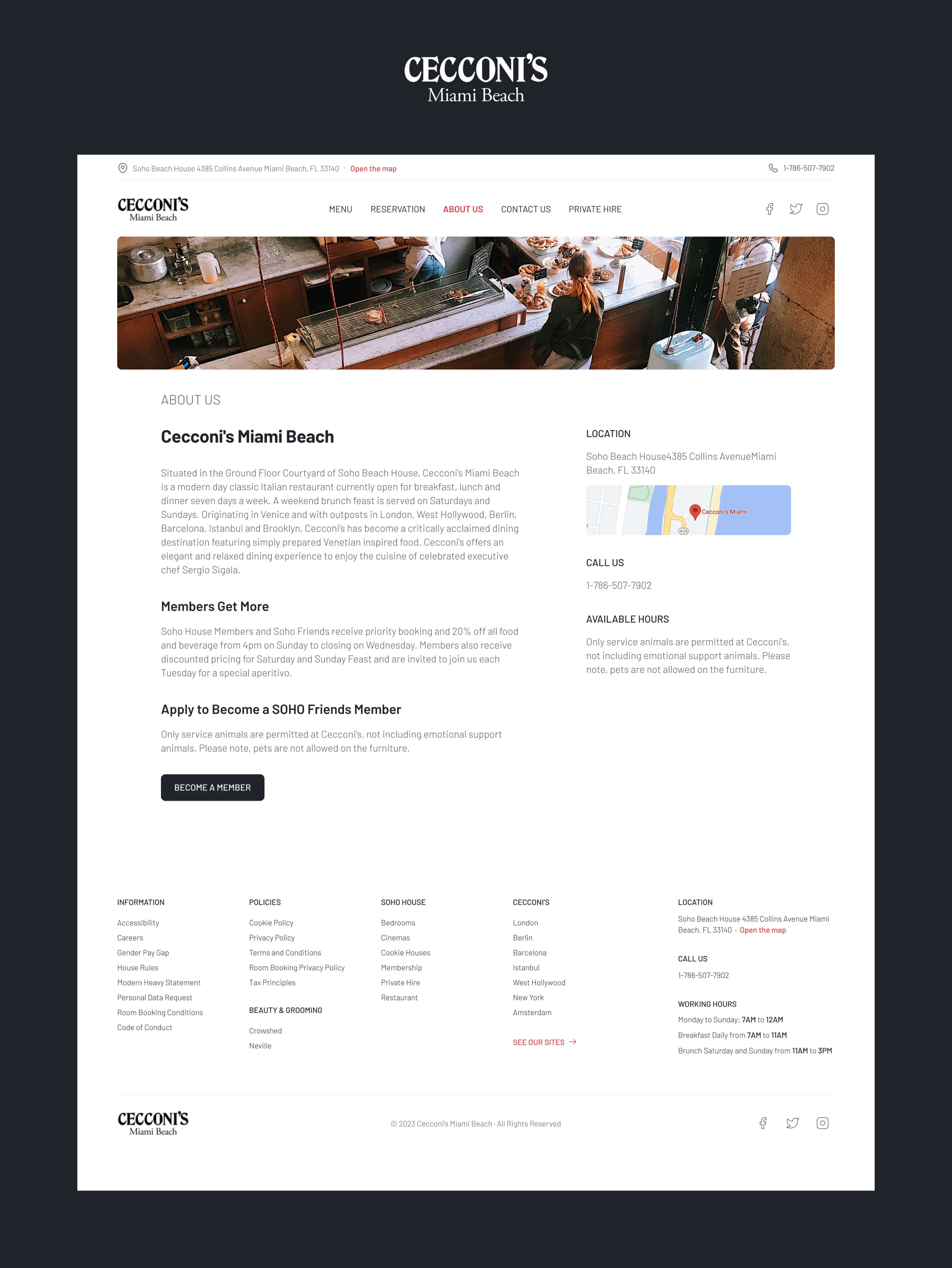
Information Architecture: Restructured content into separate pages to reduce cognitive load and improve user focus. This approach enhances site organization, cleanliness, and SEO friendliness, facilitating user tasks such as table booking and contact.
Menu Integration: Integrated the menu directly into the website, eliminating the need for PDF files and ensuring seamless readability, accessibility, and SEO optimization. Each menu category guides users to dedicated static pages for a user-friendly experience.
Typography and Images: Selected the ‘Barlow’ font family for its readability and aesthetic appeal, complementing the website’s design. Utilized temporary stock images to maintain visual consistency, with plans for customer collaboration for final image selection.
Final Design
Here are the design solutions I’ve come up with, meticulously crafted to embody the essence of Cecconi’s Miami Beach.
