Creating a Design System and Tokenomics
"Design systems provide a shared language and set of guidelines that enable teams to work more efficiently and create more cohesive user experiences." - Nathan Curtis
Overview
Creating this project for Joi Gifts aimed to establish a unified design system that ensures consistency and efficiency across all platforms, including desktop, mobile web, and native applications. The project started with a clear need to streamline design and development processes, ultimately leading to a more cohesive and user-friendly product.
Objectives
- Establish a comprehensive design system for Joi Gifts.
- Ensure design and usability consistency across all platforms.
- Bridge the gap between design and development teams.
- Create a more efficient workflow, reducing costs and effort in future developments.
Introduction
The project began with a clear articulation of the need for a design system to the entire team. Explaining that future developments would be more cost-effective and require less effort, I highlighted the importance of achieving consistency in design and usability across Joi Gifts’ applications. This initiative aimed to eliminate the gaps between design and development, creating a more efficient workflow.
Research and Incremental Approach
My approach was incrementalist, starting with the essentials and expanding the design system as needed. I began by creating a component checklist, identifying the necessary components for the initial phase and excluding non-essential ones.
Token Creation
To visualize and understand our design needs, I focused on creating design tokens. Using Figma, I compiled all necessary values for colors, typography, spacing, sizing, shadows, etc., into a single file. The goal was to convert these tokens into a JSON format and share them with developers via GitHub. This method allowed for quick updates in the codebase whenever changes were made to the tokens. I utilized the Token Studio for Figma plugin to create these tokens.
Below, you can see how I’ve conceptualized some of the design tokens.
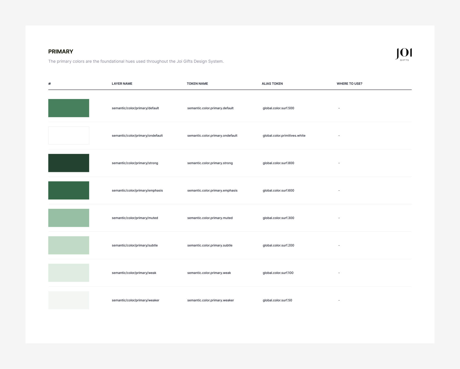
The primary colors are the foundational hues used throughout the Joi Gifts Design System.
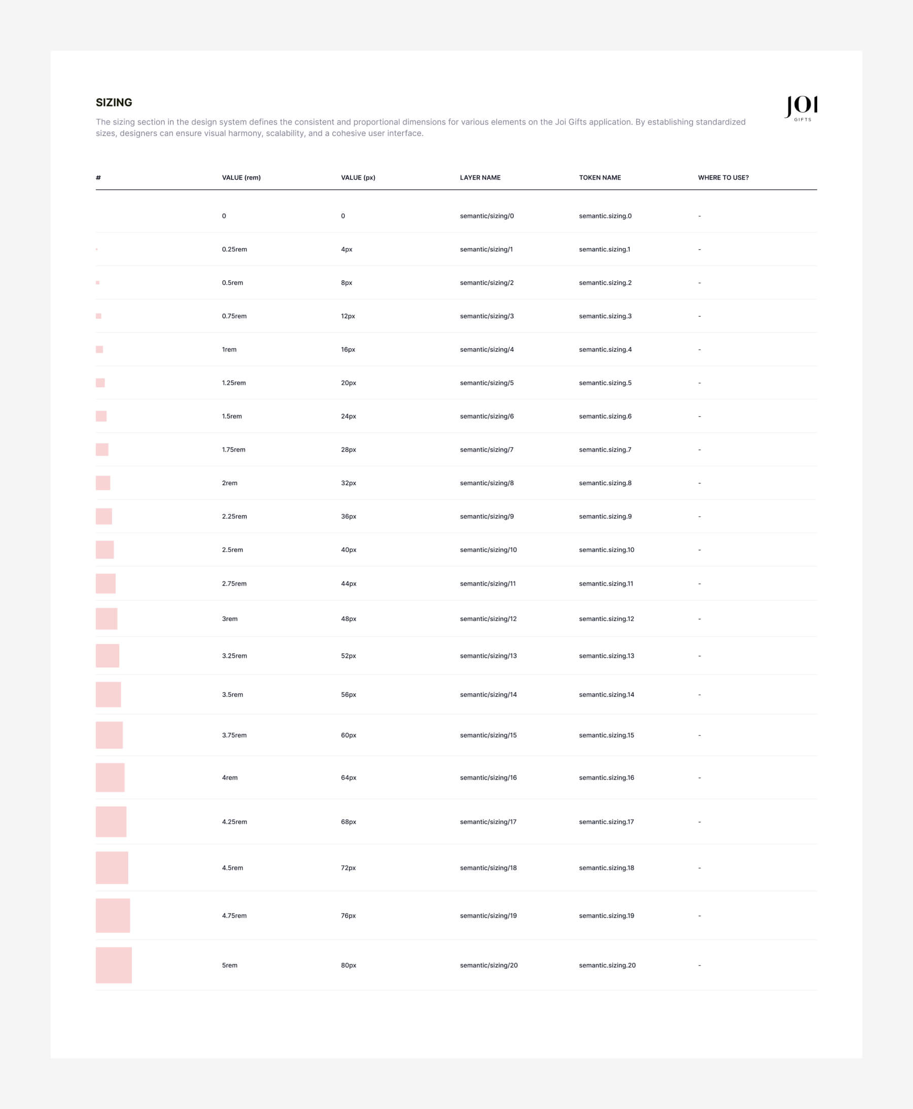
The sizing section in the design system defines the consistent and proportional dimensions for various elements on the Joi Gifts application.
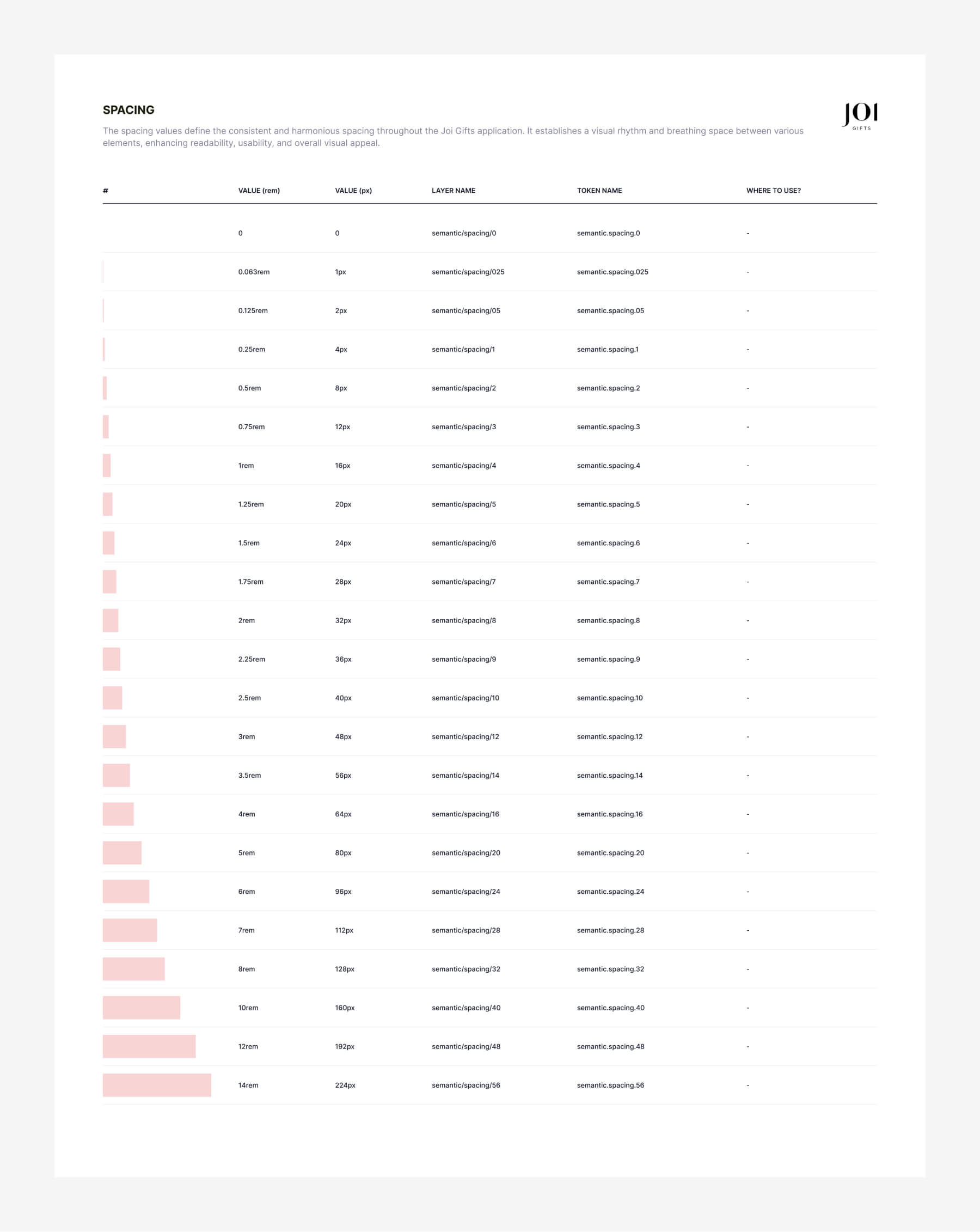
The spacing values define the consistent and harmonious spacing throughout the Joi Gifts application.
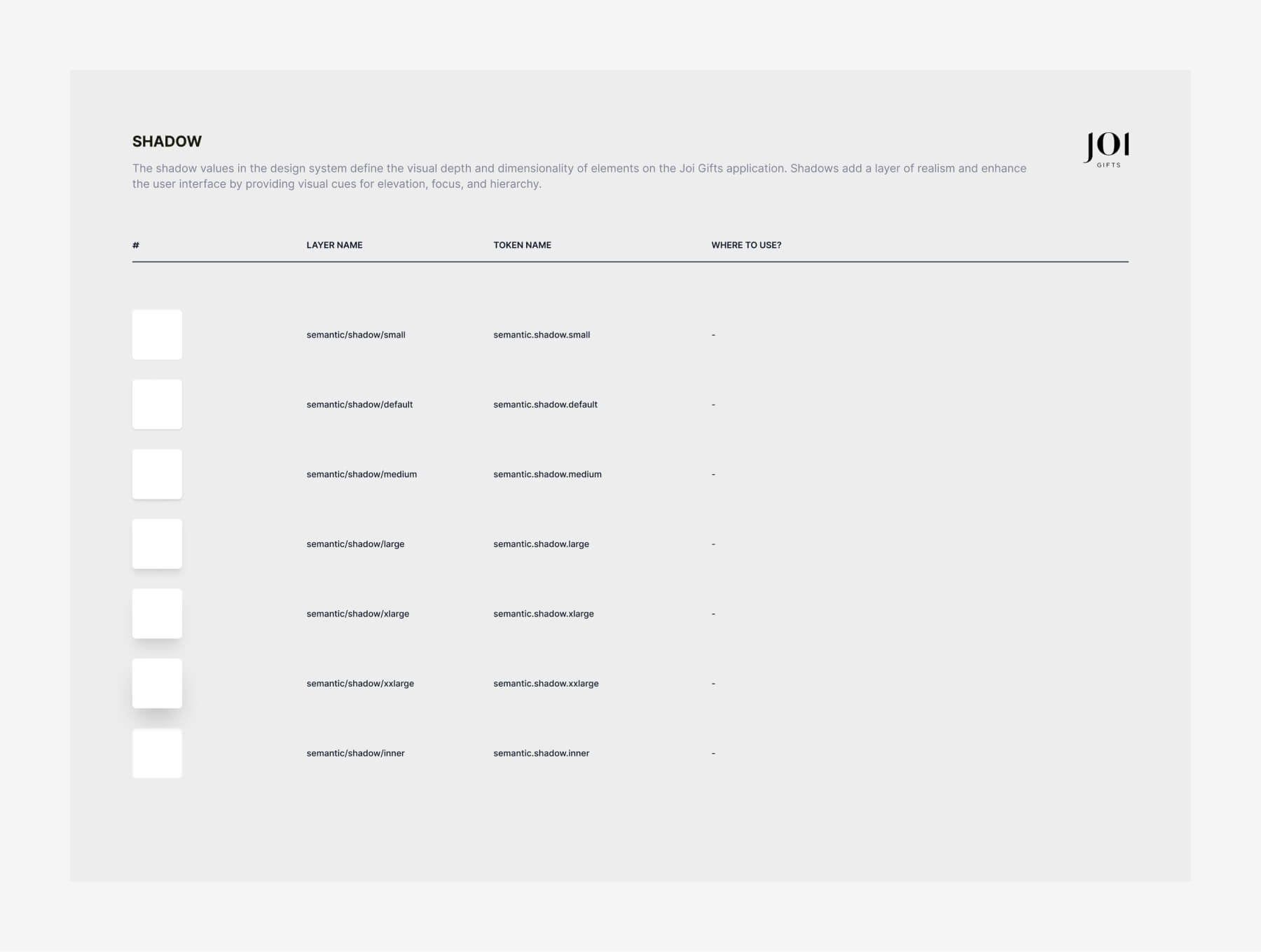
Shadows add a layer of realism and enhance the user interface by providing visual cues for elevation, focus, and hierarchy.
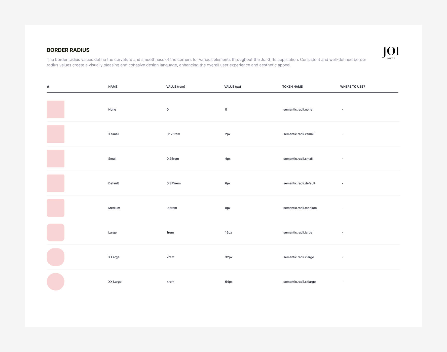
Consistent and well-defined border radius values create a visually pleasing and cohesive design language, enhancing the overall user experience and aesthetic appeal.
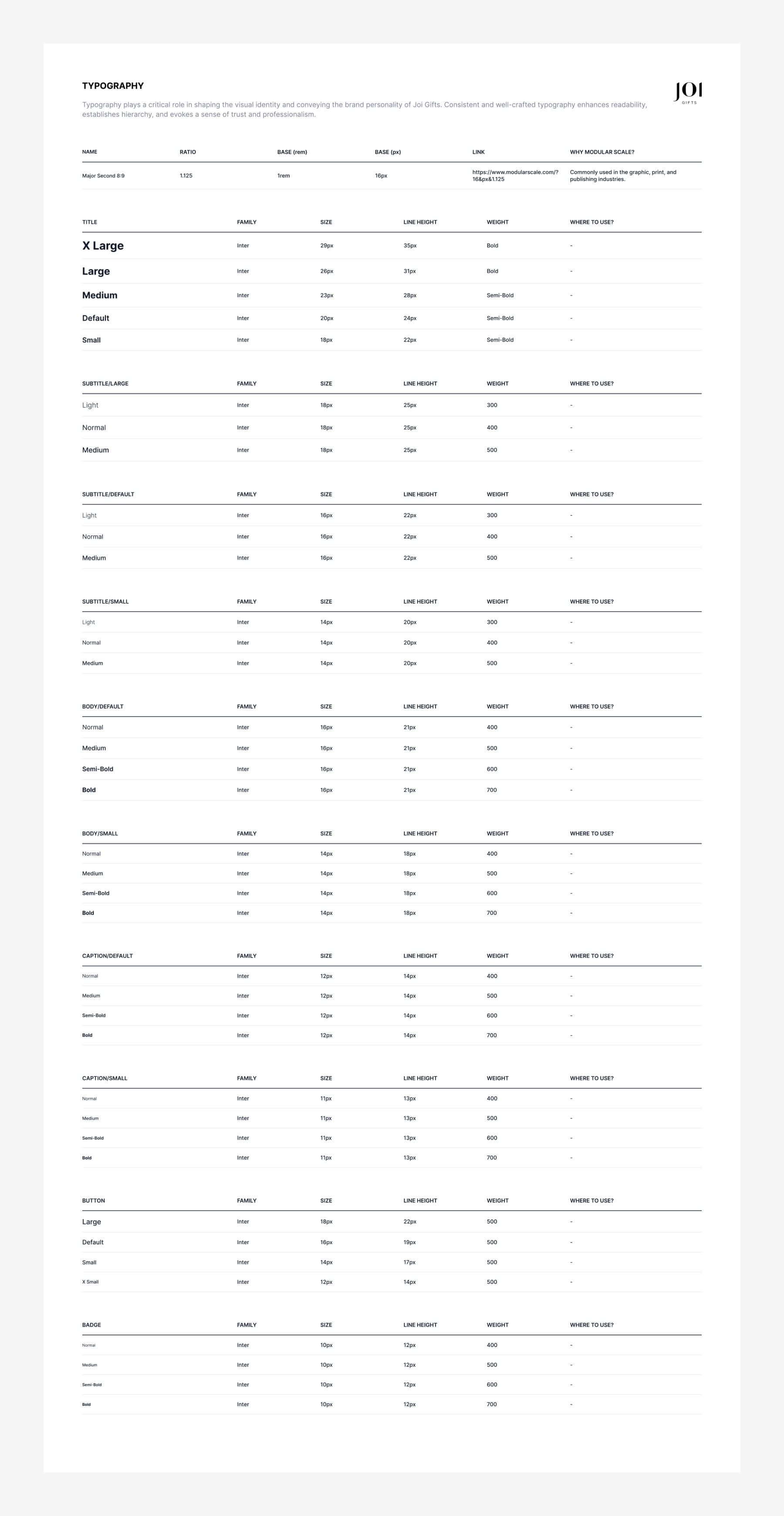
Consistent and well-crafted typography enhances readability, establishes hierarchy, and evokes a sense of trust and professionalism.
Collaboration and Development
Frequent meetings with developers ensured the successful finalization of this process. With the design tokens in place, I started building the previously identified components for the design system. As Joi Gifts’ design and development processes progressed, the design tokens and components were updated as needed.
Challenges
The primary challenge was convincing the team and business stakeholders to adopt such a system. Although initially costly and effort-intensive, the long-term benefits to the business were invaluable.
Components
The collaborative efforts of the entire team resulted in a comprehensive design system. This system includes basic components like inputs, checkboxes, radio buttons, and buttons, as well as icons and flags, covering all application needs.
Here you can see some of the components I’ve created.
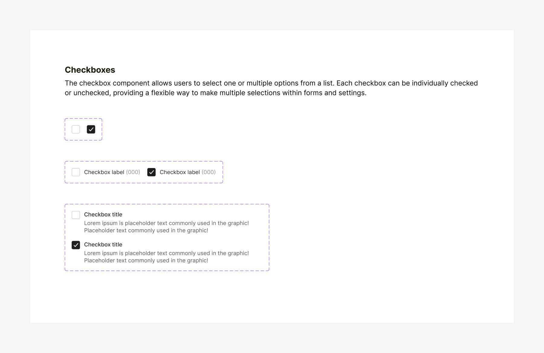
The checkbox component allows users to select one or multiple options from a list. Each checkbox can be individually checked or unchecked, providing a flexible way to make multiple selections within forms and settings.
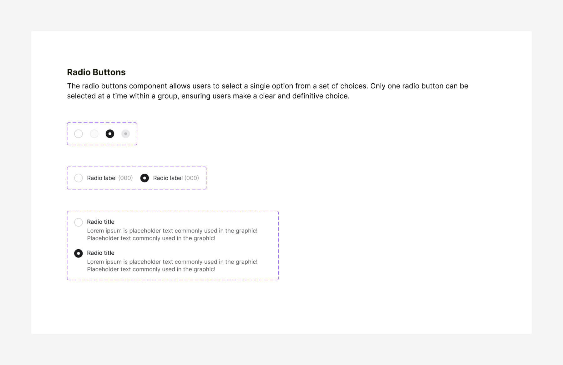
The radio buttons component allows users to select a single option from a set of choices. Only one radio button can be selected at a time within a group, ensuring users make a clear and definitive choice.
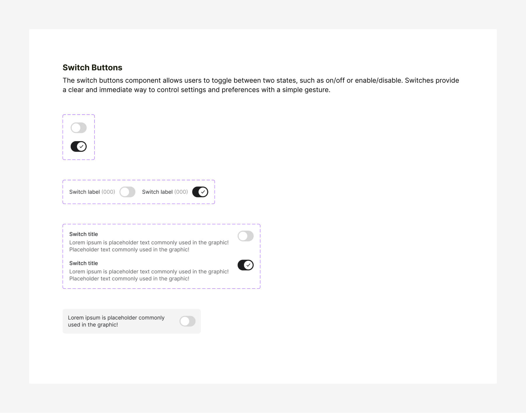
The switch buttons component allows users to toggle between two states, such as on/off or enable/disable. Switches provide a clear and immediate way to control settings and preferences with a simple gesture.
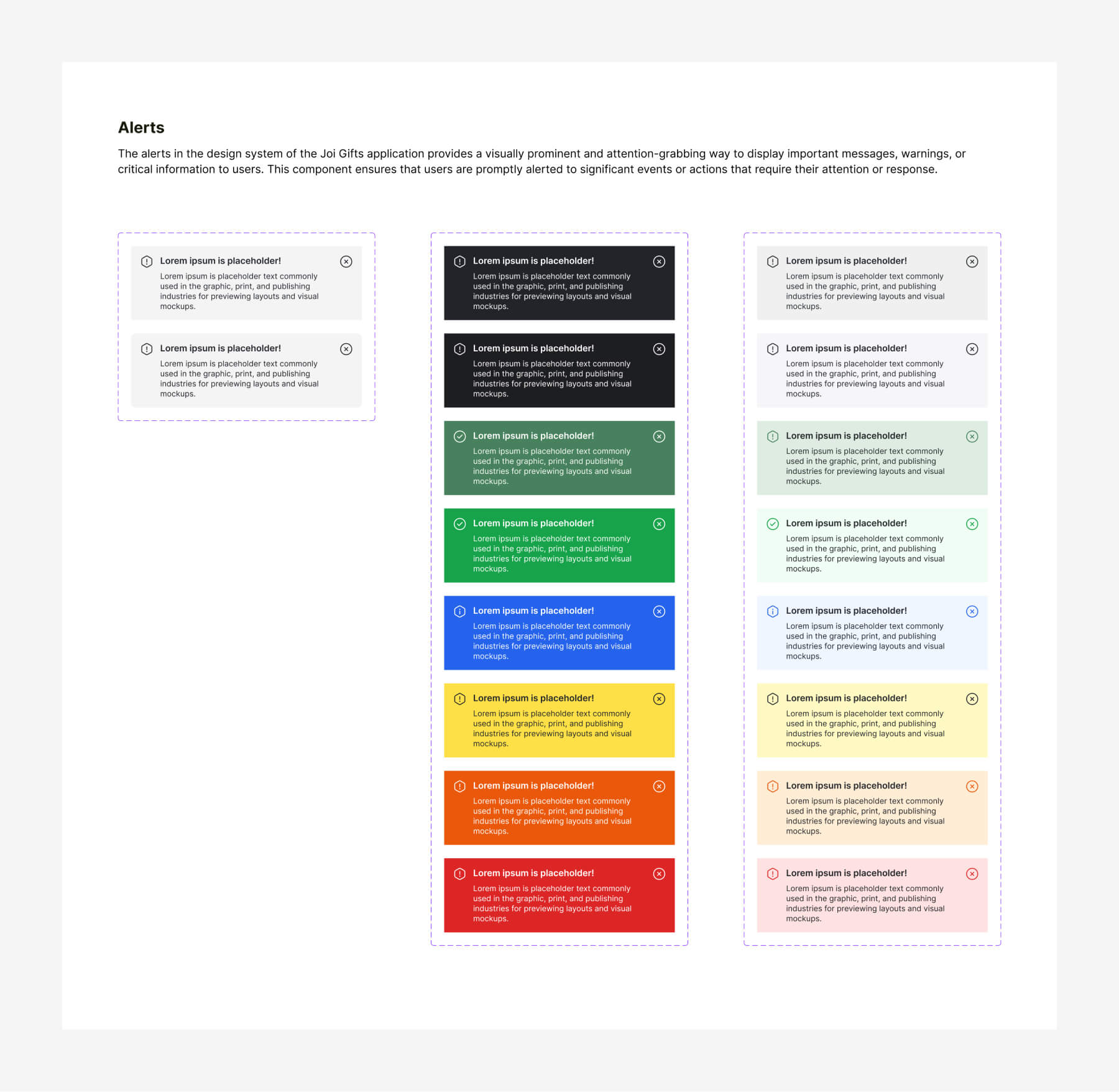
The alerts in the design system of the Joi Gifts application provides a visually prominent and attention-grabbing way to display important messages, warnings, or critical information to users.
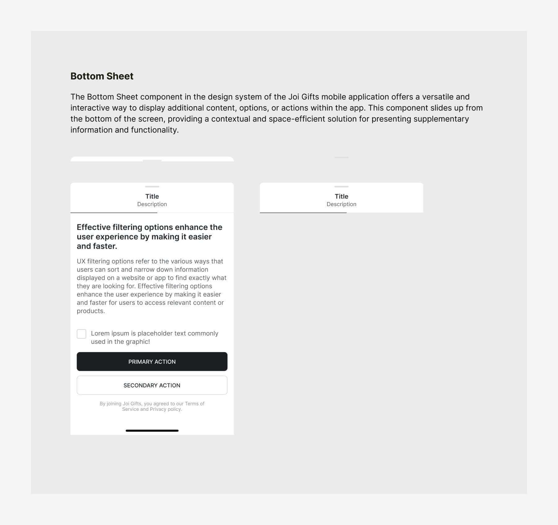
The Bottom Sheet component in the design system of the Joi Gifts mobile application offers a versatile and interactive way to display additional content, options, or actions within the app.
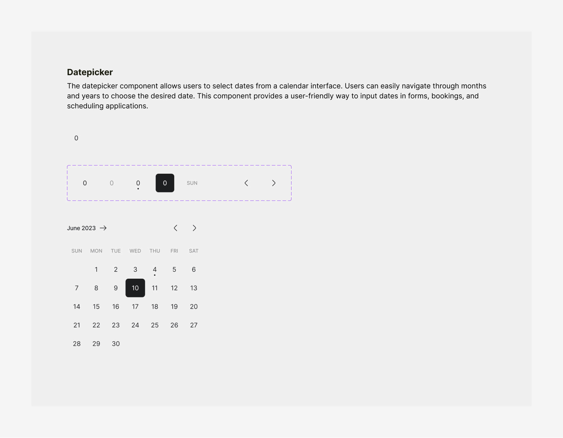
The datepicker component allows users to select dates from a calendar interface. Users can easily navigate through months and years to choose the desired date.
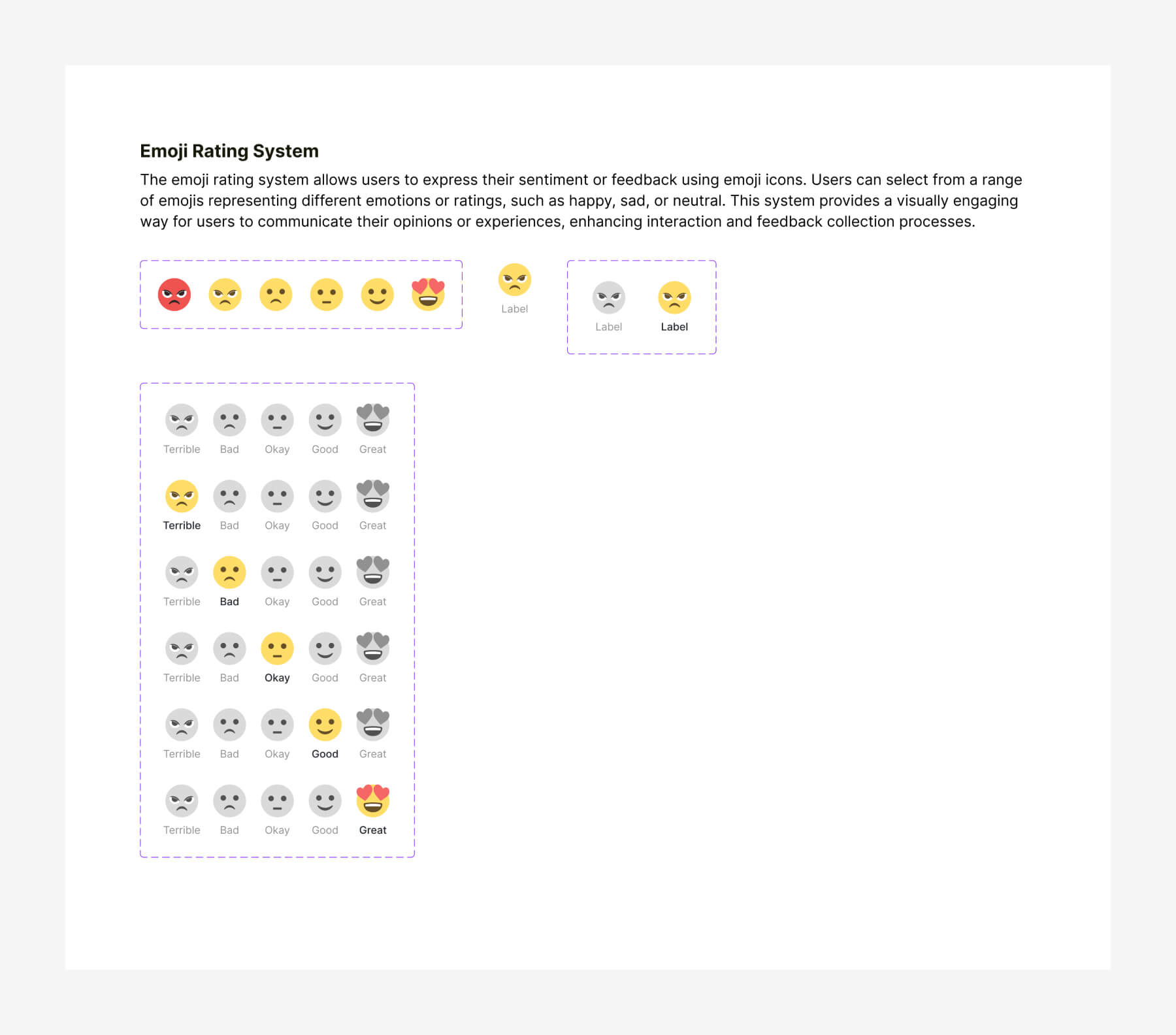
The emoji rating system allows users to express their sentiment or feedback using emoji icons.
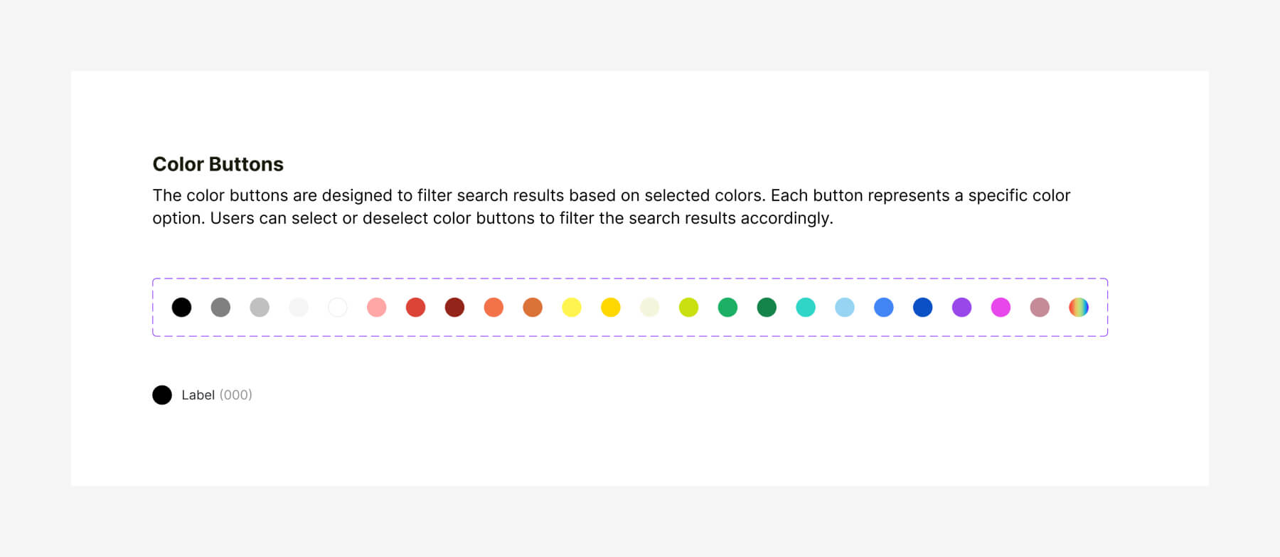
The color buttons are designed to filter search results based on selected colors. Each button represents a specific color option. Users can select or deselect color buttons to filter the search results accordingly.
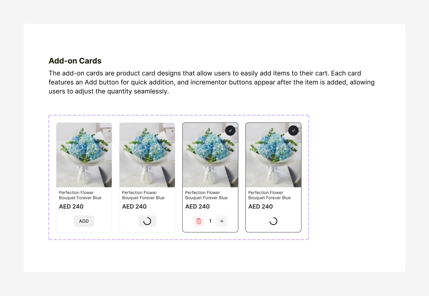
The add-on cards are product card designs that allow users to easily add items to their cart. Each card features an Add button for quick addition, and incrementor buttons appear after the item is added, allowing users to adjust the quantity seamlessly.
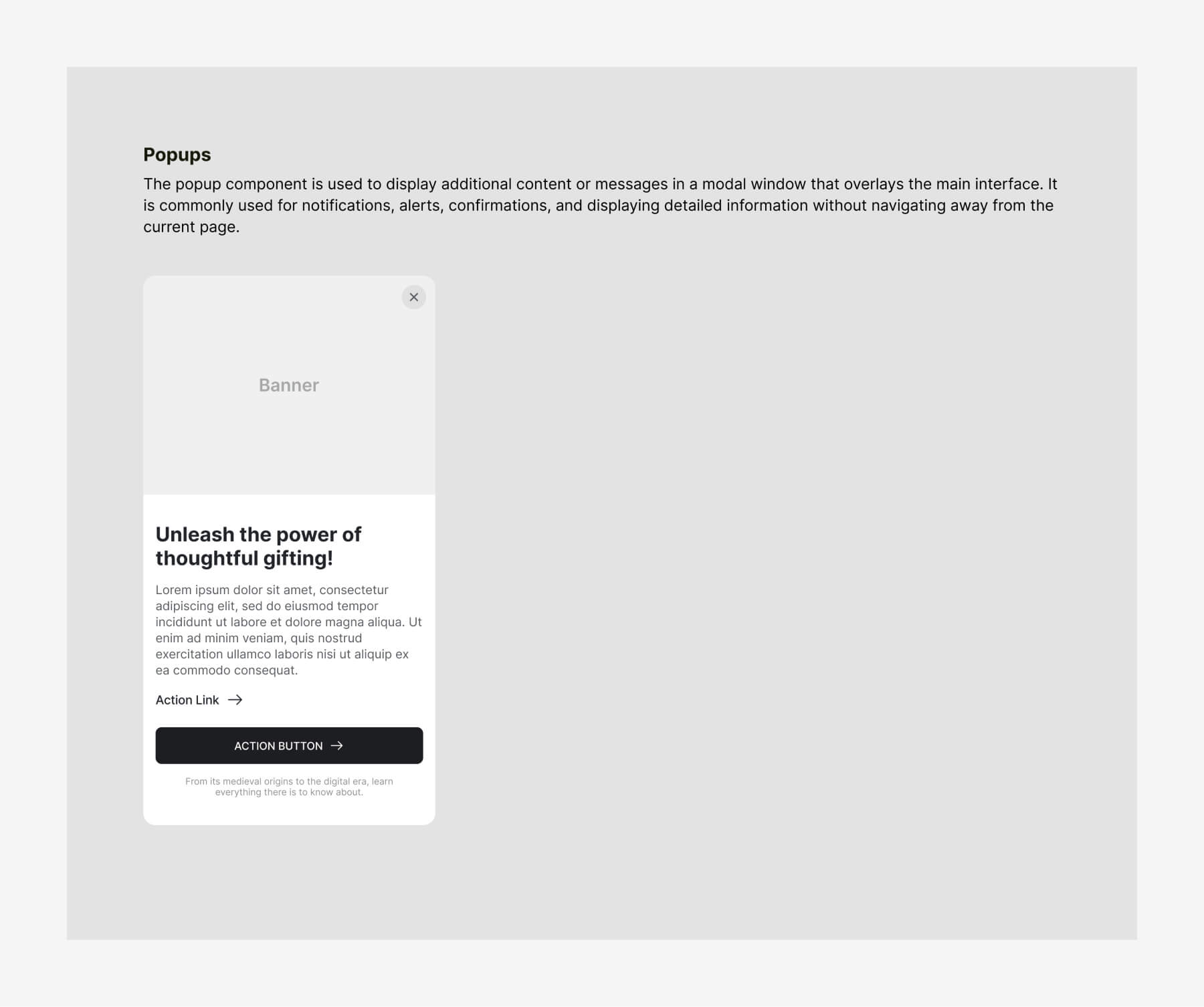
The popup component is used to display additional content or messages in a modal window that overlays the main interface. It is commonly used for notifications, alerts, confirmations, and displaying detailed information without navigating away from the current page.
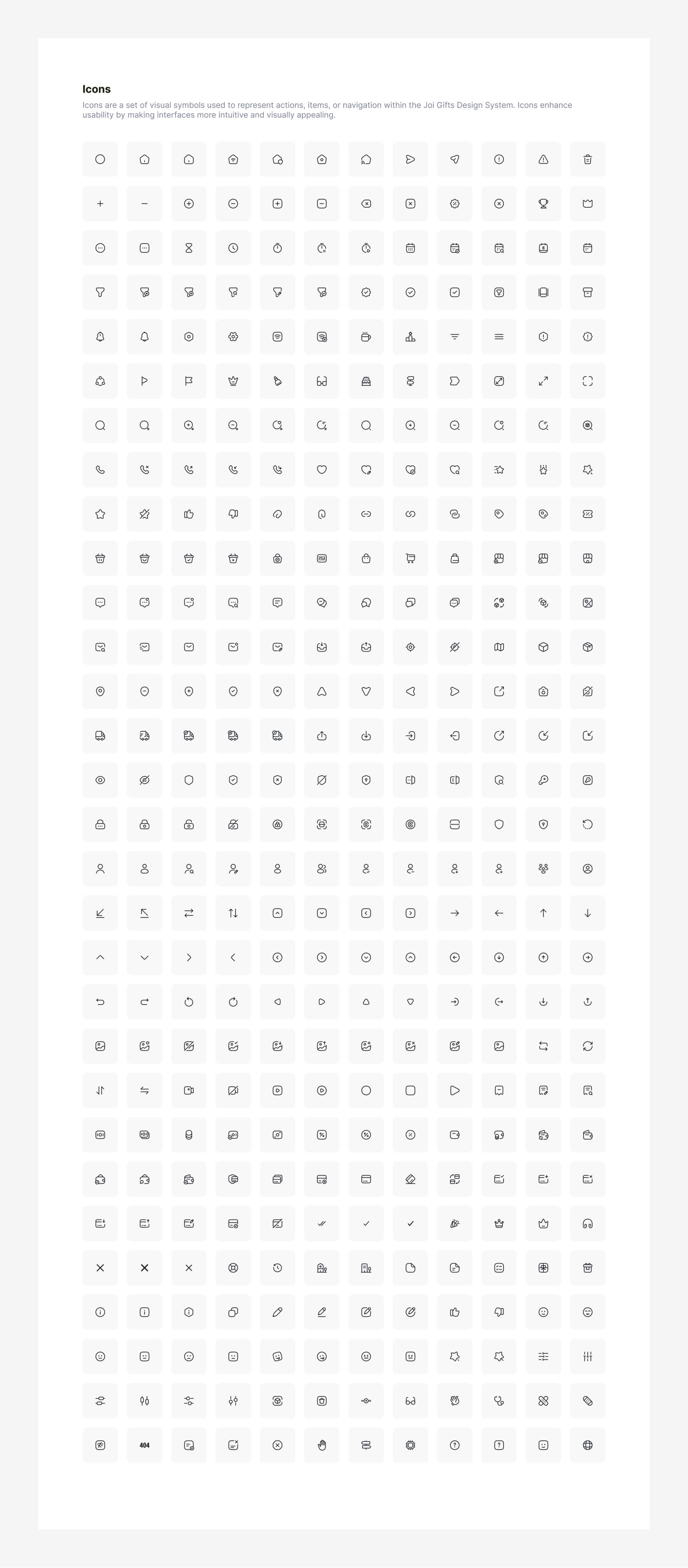
Iconography
In the Joi Gifts Design System, icons play a crucial role in enhancing both functionality and aesthetics. The process of selecting icons was meticulous and collaborative, ensuring both accessibility and visual appeal.
The selection criteria included appropriate stroke thickness to ensure clarity at different sizes, and readability to ensure each icon clearly conveyed its intended meaning. We also prioritized accessibility standards, selecting icons that would be usable and understandable for all users, including those with visual impairments.
Ultimately, the chosen icons balanced both accessibility and aesthetics. They not only enhance the user experience by being easily recognizable and interpretable but also contribute to the overall visual harmony of the Joi Gifts applications.
Icons are a set of visual symbols used to represent actions, items, or navigation within the Joi Gifts Design System. Icons enhance usability by making interfaces more intuitive and visually appealing.
Country Flags
Country flags are an integral part of the country selection flows in the Joi Gifts applications. They provide users with a clear and recognizable way to select their country, enhancing the overall user experience.
I shared these versatile flag designs with the Figma community, where they have been embraced and utilized by thousands of designers worldwide. This contribution not only supports the design community but also highlights the importance of adaptable and accessible design assets.
Here’s the link to the Awesome Country Flags.
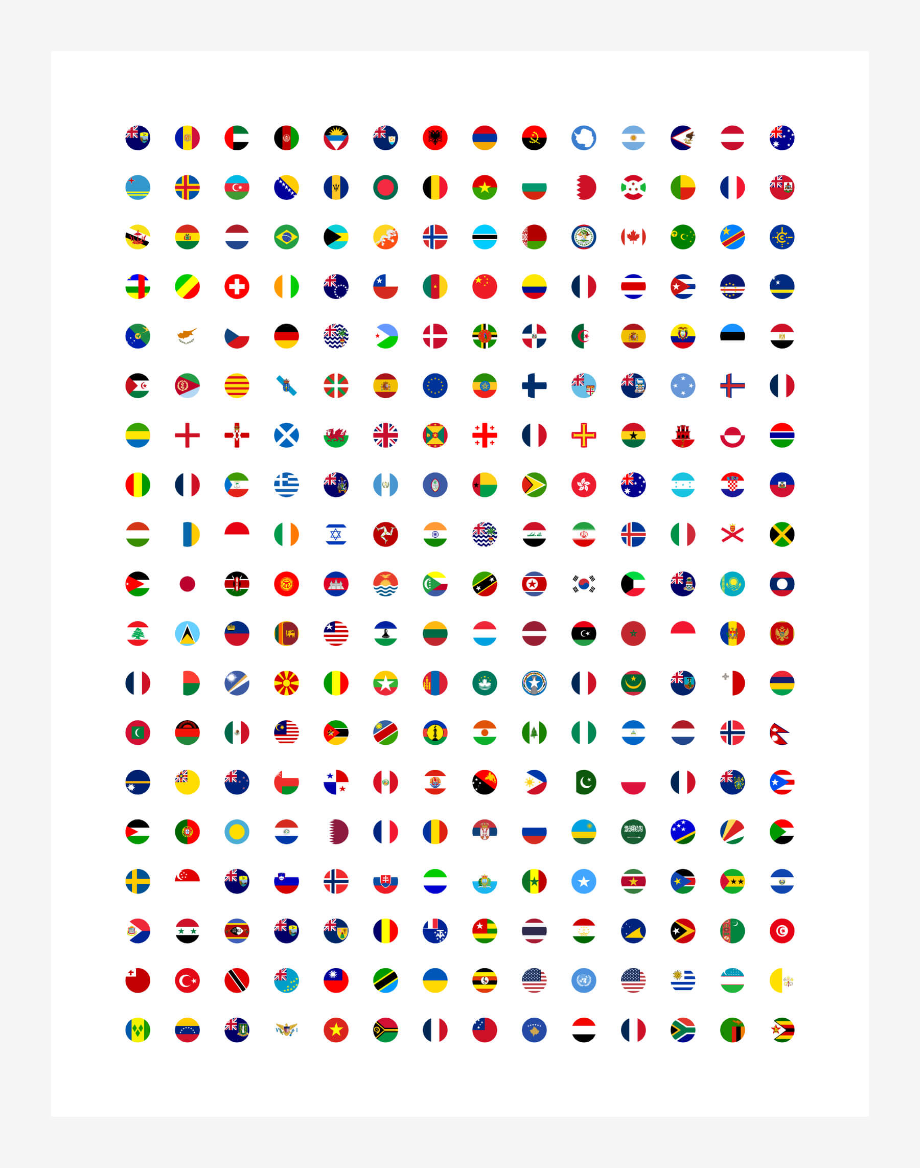
To offer more flexibility and meet various design needs, I expanded these flags to include square, rounded, and circular versions. These variations cater to different design contexts and preferences, ensuring a consistent and visually appealing look across all platforms.
Conclusion
The design system has become an organic and evolving tool that meets Joi Gifts’ diverse needs. To see how these components are effectively utilized in the application, please refer to the Joi Gifts Mobile App Design project.
Thank you for reading so far.